Spotify Playlist Covers
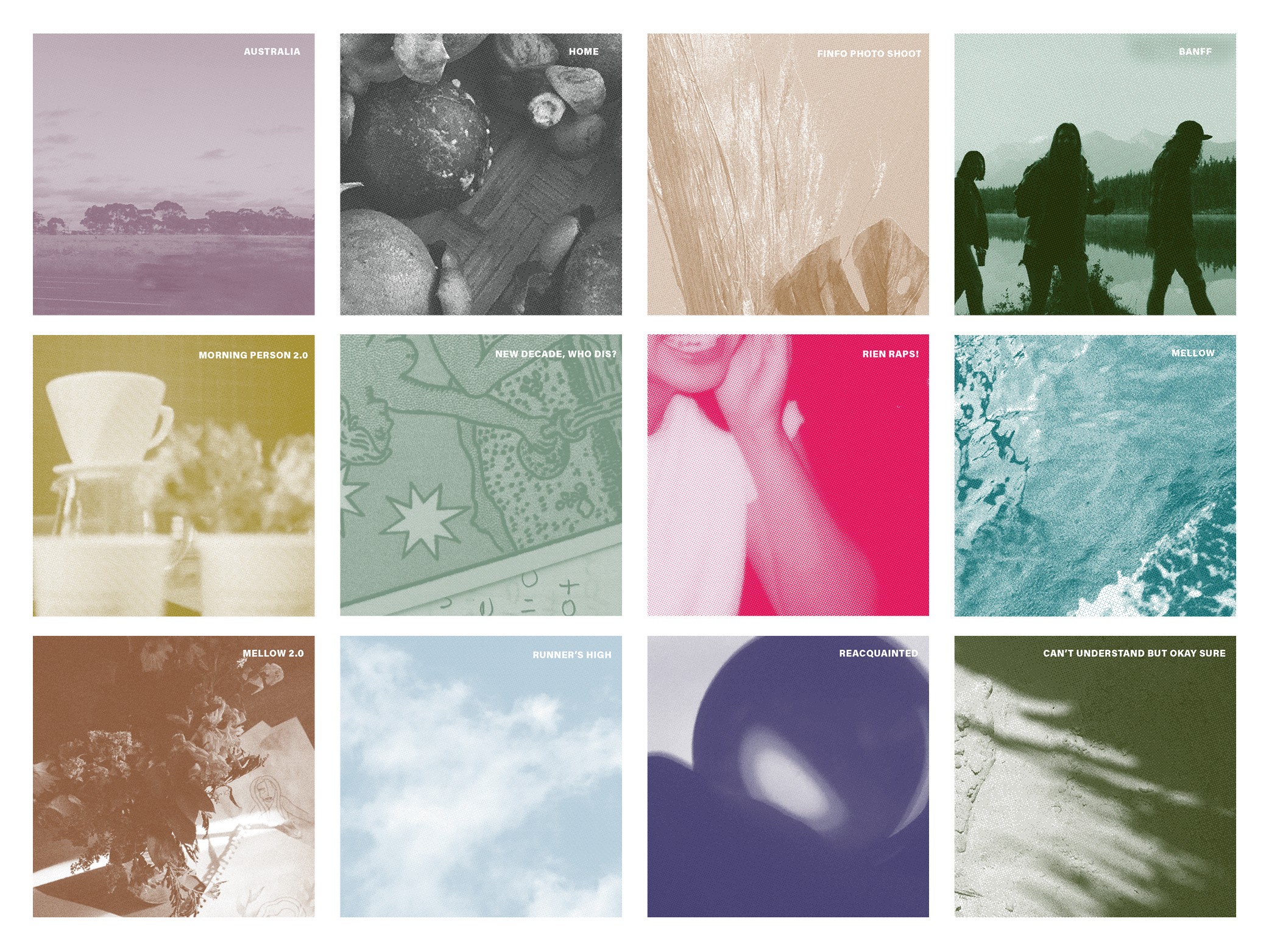
If you know me personally, you know I take Spotify way too seriously. I’m a big fan of 2 things: music and organization. My songs are arranged based on a certain feeling or a time period in my life, like a trip abroad or my last year of school. I’m also a big fan of making everything in my life pretty. Naturally, I take my playlist covers seriously too.
To justify the amount of time I spend on Spotify, I’m sharing the design process and stories of some of my playlist covers.
Although it may seem that I approach the design of the covers in a logical and analytical way, you’ll notice that a lot of the design decisions I make are based on intuition. Music is emotional to me, and I think using feelings instead of thoughts make the most fitting playlist covers.
The Anatomy
Photo
The photos that I use for covers evoke the mood of the playlist. I choose photos that are meaningful to me. At the same time, I try to design the covers in a way that doesn’t seem like it’s made specifically for me. I want other people to enjoy my playlists, and feel like the collection of songs can be theirs too.
Color
I use the duotone feature on Photoshop to add the colours to the photos. Similar to how I choose the photos, I select hues that best represents the mood of the playlist. I try and stick to similar values and saturation to make the collection of covers cohesive. However, if a playlist calls for bold, I’m going bold (see the bright pink for Rien Raps!).
Bitmap Mode
Bitmap is a file format that displays images through a pattern of dots. Ever since I took a screen printing class, I’ve been obsessed with turning images into bitmaps. I make all of the playlist photos into a bitmap to add visual interest by emulating what a physical print would look like. If you look at my covers closely, you’ll notice that they look “grainy”.
Title
I challenge myself to come up with uncommon playlist titles. Like instead of naming a new playlist Spring 2020 (no shame to people who do), I name it The Greatest Latest because it’s a collection of great songs that I’ve been listening to lately. Again, I take Spotify way too seriously. But it’s fun!
Stories Behind Covers
Romanticizing Reality is my favourite playlist out of all of the ones I created. I started it in 2017, and it now has more than 190 songs. Romanticizing Reality is a collection of songs that make life feel like a movie. The image I used is from a photo I took while having brunch with friends. What is more romanticized than the idea of brunch with friends on the weekend?
I chose the colour pink because it embodies the feeling of beauty in everyday life for me. The right shades of pink can make anything mundane cool. For example, the famous pink wall
I chose to make it pink because that colour embodies the feeling of beauty in everyday life for me. Pink is a colour that can make anything cool- Paul Smith’s Pink Wall.
Concurrent is where I put all of those songs that are upbeat, yet chill at the same time (hence, the name concurrent which means happening at the same time). The photo I used is from a summer day at The Ex, an annual event in Toronto full of rides and fun booths. The photo represents the mood of the playlist because while riding those hanging chairs is relaxing, the overall energy of the festivity is fast-paced and energetic.
The blue-green colour reminds me of how water can concurrently be gentle and dynamic at the same time.
I started this playlist after hearing Vibin’ Out with ((( O ))) by FKJ. The songs in this collection make me feel like I’m floating or going through life in a trance-like way. I chose a photo from Yayoi Kusama’s Infinity Mirrors to represent the otherworldly feeling the songs evoke. I especially love listening to Hate the Word Vibe but VIBE when I’m driving.
The colour is a dark mustard to symbolize a moody glow.
Evolution of Covers
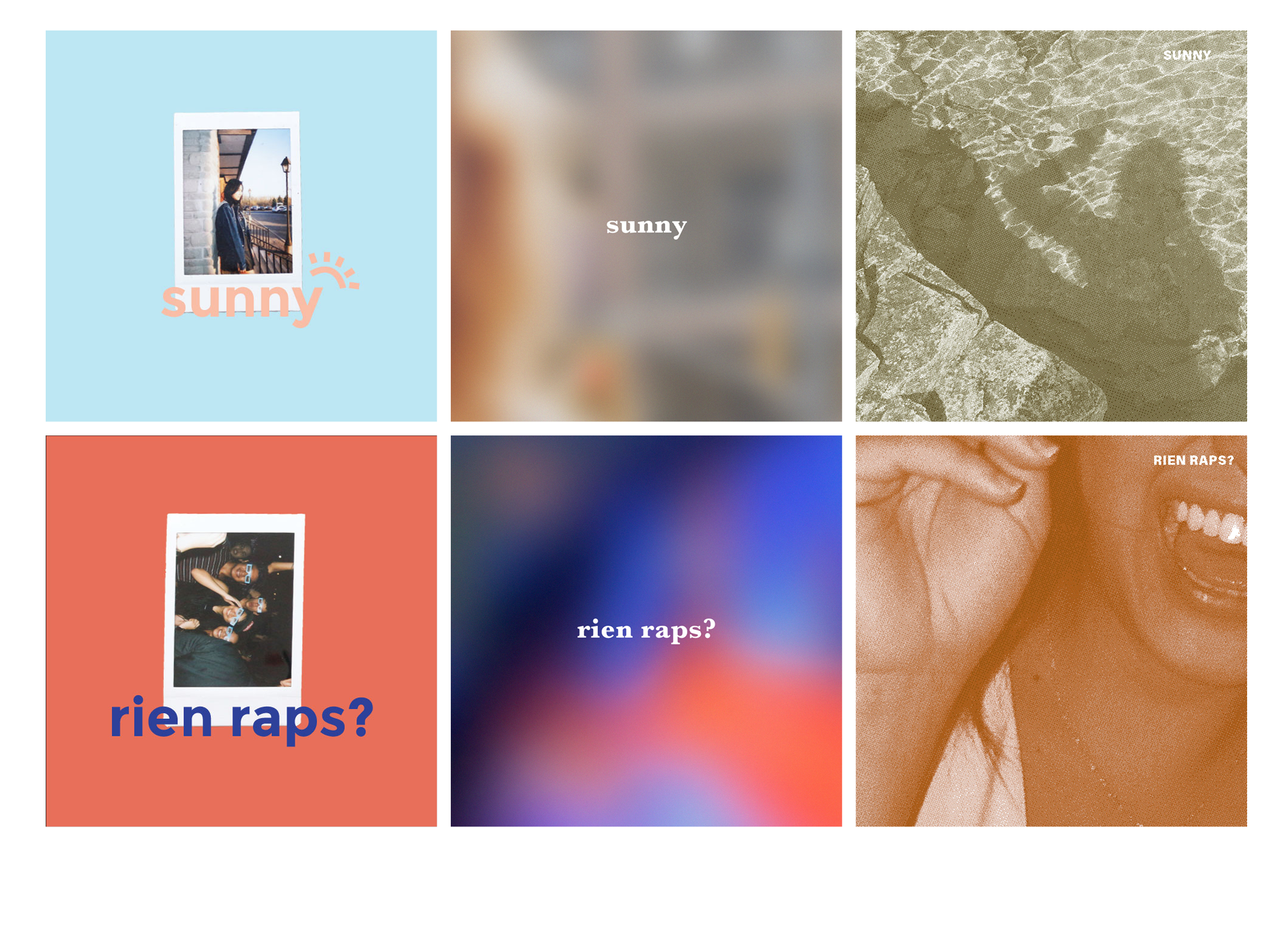
The first set of playlist covers I designed in 2017 look extremely different from the current design. Here is a look into the evolution.
I hope this post inspires you to get creative with your own playlists. If you do decide to design covers, let me know! I would love to check it out. If you want to see more covers I made, you can visit my Spotify. ‘Til the next post!


